Based on the need-finding, I made a persona and a journey map that guided me throughout the design process.

I highlighted the touchpoints in the user’s life in the journey map and used it to identify the possible opportunities

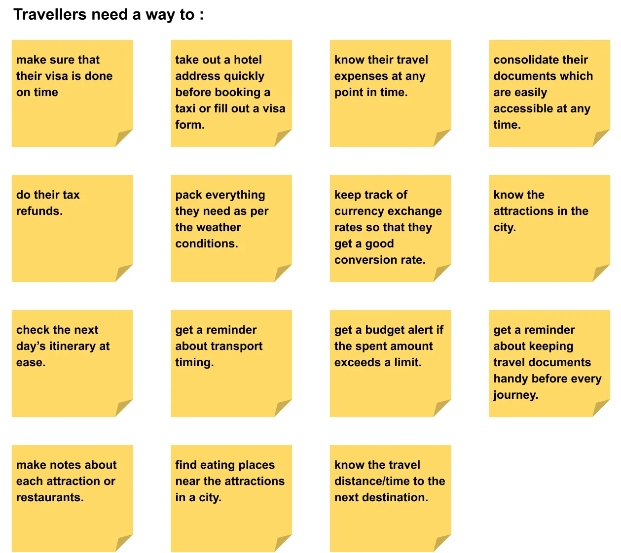
How might we simplify the trip planning and organization experience for travelers?
After I found out the main opportunity area, I started the ideation process with brainstorming to generate a large number of ideas about the things travelers need.
Moreover, I studied different existing travel apps to draw some inspirations from the features they offer.

Based on the outcome of the brainstorming session, I created a storyboard that compliments the opportunity area.

I showed the storyboard to the participants to get their opinion on the idea.
Documents should be linked to a main itinerary to make it easily accessible.
Keeping in mind the three ideas from the storyboard, I created how users can do the tasks in an effortless manner.
Participants:

User flow helped by guiding me throughout the preparation of my first prototype. In the paper prototype, I added the features to make a travel itinerary and upload all the essential tickets and documents.
User tasks:

After building the paper prototype, I scheduled an in-person usability evaluation. I asked them to think aloud during the entire session.
Then I got them evaluated by other two UX designers who are working in the industry. This time the evaluators took note of the Heuristic violations with a severity rating. Based on the evaluations, the most common problem was with “Freedom” and “Flexibility” and there were a few consistency issues.

Later, I made a consolidated list of heuristic violations and a list of changes that improved my prototype further.
After making the improvements to my paper prototype, I drafted it on Figma with full navigation.

At this stage, I invited two participants to test my prototype. I assigned them the task and let them complete the task in 5 minutes maximum. I told them that I am not testing them but the prototype I made.
I observed them interacting with it and noted their breakdown points. This helped me make a few more changes in the prototype.
With this user testing, I found that users were facing difficulty in selecting dates and checking the next day’s itinerary. So I redesigned the date selector and made the itinerary scrollable to give more freedom to the users. Here are the two designs of the same component:

I prepared two different linked designs on Figma with all the navigation called Design-A and Design-B. Then I carried out an online user test on User Testing.com
I assigned Design-A to two of the users and Design-B to the other two. The testing helped me decide that the redesign was more user-friendly and it was adopted in my final design. The user testing also helped me in finding other usability issues with the prototype.
Check out the Improved wireframe.

I used visual language to develop the wireframe into a high-fidelity prototype. Then I ran another user test to find out any other usability issues. This helped me in doing some more iterations in the design.


You can find the final prototype here.
It is the key to a successful user interview. Close-ended questions stalled by saying “Yes” or “No” and unclear questions led them to keep talking in the wrong direction. The eliciting technique helped to keep the users talking in the right direction.
I learned the importance of testing designs with users at the very early stages of the design process, right from the stage where I built my first paper prototype. I found many usability issues right from the beginning and improved my design based on user feedback. Testing also helped me to create intuitive and delightful high-fidelity prototypes.